RUCKLIDGE, Joanna and WOODCOCK, Fiona (2016). Like-Letters Exhibition. [Show/Exhibition] [Show/Exhibition]
Documents
15127:111294
Image (JPEG) (Artwork)
LikeLetters2048-4.jpg - Other
Available under License All rights reserved.
LikeLetters2048-4.jpg - Other
Available under License All rights reserved.
Download (945kB) | Preview
15127:111296
Image (JPEG) (Contributors)
LikeLetters2048-47.jpg - Other
Available under License All rights reserved.
LikeLetters2048-47.jpg - Other
Available under License All rights reserved.
Download (666kB) | Preview
15127:111305
Image (JPEG) (Tools Tests and Artefacts)
LikeLetters2048-1.jpg - Other
Available under License All rights reserved.
LikeLetters2048-1.jpg - Other
Available under License All rights reserved.
Download (981kB) | Preview
15127:111306
Image (JPEG) (Risograph Postcard Prints)
LikeLetters2048-50.jpg - Other
Available under License All rights reserved.
LikeLetters2048-50.jpg - Other
Available under License All rights reserved.
Download (912kB) | Preview
Abstract
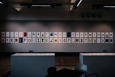
Like-Letters is a project inspired by Fiona Woodcock’s & Joanna Rucklidge’s mutual appreciation for typographic forms. They have been sharing their love of typography by ‘posting’ letters (of the alphabet) to each other, capturing the visible conversation virtually on a blog.
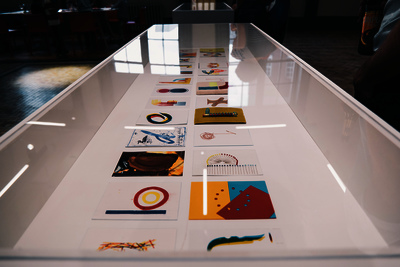
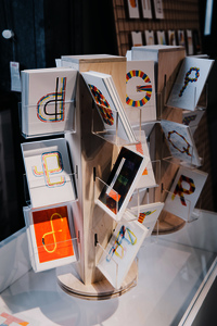
Joanna & Fiona hosted an exhibition of Like-Letters in the former Head Post Office, now the home for Sheffield Institute of Arts. The exhibition offered the opportunity to see artwork from the blog in printed form, & present the process behind the exchange. It also provided a forum to extend the project by inviting 52 acquaintances to respond creatively to the letters on the blog, and post letters (in the form of designed postcards), direct to the exhibition venue.
Creative acquaintances from around the world were invited to design a letter and post it directly to the gallery.
Each individual was assigned one letter in the original Like-Letters alphabet to respond to – i.e. required to ‘reply’ with the adjacent letter in the alphabetical sequence. The initial inspiration, reaction, interaction, & commitment to a solution within a restricted time frame encourages a particular type of fundamentally creative expression. The emerging set of postcards was an alternative alphabet capturing the diversity of personalities and responses, whilst highlighting how creative connections can be maintained despite geographical distance.
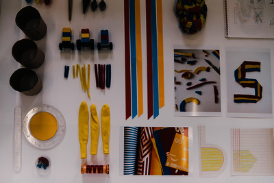
The exhibition also included a cabinet of tools, tests & artefacts – a range of objects, sketches & crafted letters that all contributed to the final letters on the original blog. These were to highlight the making processes behind the range of letters created, and expose the traditional methods & craft employed throughout. It was also a way to appreciate typographic design in its most basic form – making it more accessible for all.
The project explored ways to engage and invite people to be creative in response to a visual prompt. Using the alphabet as an accessible form, with familiar primary coloured materials, people were invited to design letters and ‘play’ with form and legibility.
More Information
Statistics
Downloads
Downloads per month over past year
Share
Actions (login required)
 |
View Item |


 Tools
Tools Tools
Tools![[thumbnail of Artwork]](https://shura.shu.ac.uk/15127/1.hassmallThumbnailVersion/LikeLetters2048-4.jpg)

![[thumbnail of Contributors]](https://shura.shu.ac.uk/15127/2.hassmallThumbnailVersion/LikeLetters2048-47.jpg)

![[thumbnail of Tools Tests and Artefacts]](https://shura.shu.ac.uk/15127/3.hassmallThumbnailVersion/LikeLetters2048-1.jpg)

![[thumbnail of Risograph Postcard Prints]](https://shura.shu.ac.uk/15127/4.hassmallThumbnailVersion/LikeLetters2048-50.jpg)

