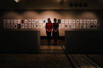
RUCKLIDGE, Joanna and WOODCOCK, Fiona (2015). Like-Letters. [Artefact] [Artefact]
Documents
15126:111292
Image (JPEG) (The whole alphabet, with creators)
LikeLetters2048-114.jpg - Other
Available under License All rights reserved.
LikeLetters2048-114.jpg - Other
Available under License All rights reserved.
Download (1MB) | Preview
Abstract
Like-Letters is a project inspired by Fiona Woodcock’s & Joanna Rucklidge’s mutual appreciation for typographic forms. They have been sharing their love of typography by ‘posting’ letters (of the alphabet) to each other, capturing the visible conversation virtually on a blog.
The alphabet design borrows from the concept of written exchanges & love letters - each response is a direct ‘reply’ to the previous design. The visual dialogue captures the ‘to & fro’ of ideas, craft & character. The alphabet includes upper & lower case, and by exchanging every two weeks, the project ran neatly for 52 weeks of one year.
The letters were created using the limitation of three colours – blue, yellow & red – to help unify them. There were no rules restricting media type, so a variety of visual tools and methods were employed. The overall set of letters represent the playful, individual and experimental nature of the way they were generated. The creative process was fundamentally collaborative – and highlights the importance of personal relationships as a catalyst for creative thought and action.
More Information
Statistics
Downloads
Downloads per month over past year
Share
Actions (login required)
 |
View Item |


 Tools
Tools Tools
Tools![[thumbnail of The whole alphabet, with creators]](https://shura.shu.ac.uk/15126/1.hassmallThumbnailVersion/LikeLetters2048-114.jpg)

